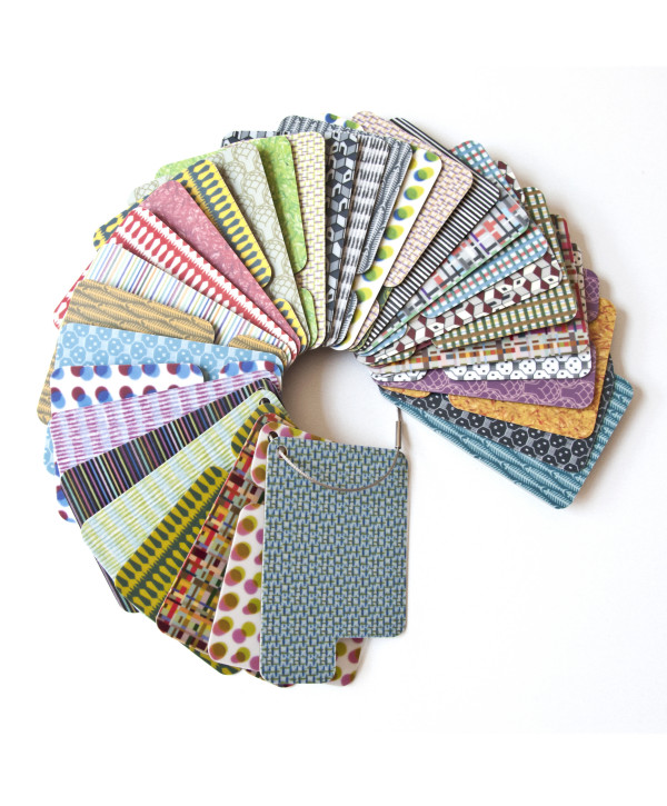
name: Parade
client: Abet Laminati
date: Milan Design Week 2012
project assistant: Alberto Ghirardello
Parade is a Collection of 12 decors, each produced in three colour shades. Each decor represents an independent project, formally recognizable, characterized by a solid narrative ability. Starting points of this research about the graphic sign are a tireless research on the single unit, not only seen as a multiplying pattern, but rather as a dense and articulate visual element – as in the case of MODULI laminates family – and freehand drawing, experienced through different painting techniques – as in the case of the FATTO A MANO laminates family. A rich range of designs, able to cross the boundaries of bi-dimension and surface to achieve a well-rooted third dimension, the dimension of narration.
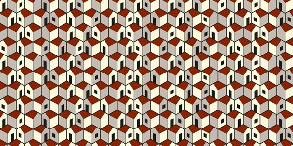
PAESEMIO: Small white houses cling to the sides of an imaginary hill, a sea of roofs, doors and windows, a tribute to the Italian landscape dotted with many small villages celebrated in a popular Italian song.
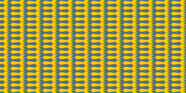
ROCKETS: The schematized representation of small rockets that intersect in the sky produces a decorative effect that recalls a colourful embroidered Greek fret.
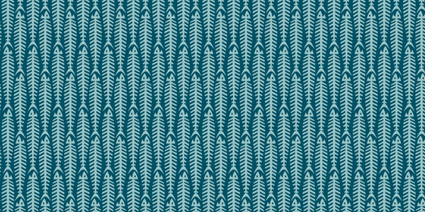
FISHBONE: A suitably schematized and simplified fishbone gives life to a graphic design of great iconic and… ironic impact!
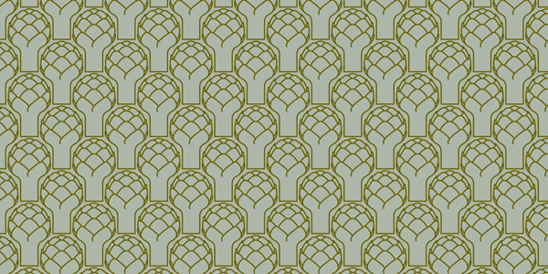
ARTICHOKE: Stylized artichokes perfectly slot together give life to an original graphic background colour already used for the wallpapers collection “Fields” designed for Jannelli&Volpi.
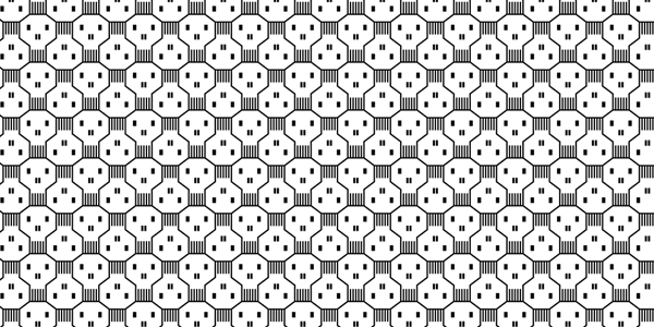
KNOCK-OUT: A geometrical and rigorous composition that gives life to endless little skulls represents the graphics of this laminate. The omonymous rug designed by Giulio Iacchetti for Nodus was created from the same drawing.
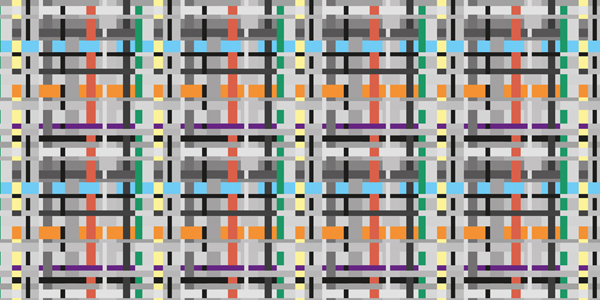
TARTAN: Lines of different thickness and colour intersect in an unusual way creating an unexpected pattern vaguely related to the classic Scottish textile.
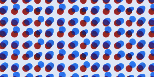
YAYOI: Yayoi is the name of the Japanese artist whose signature style is represented by polka dots. In this graphics polka dots give life to a sort of chromatic projection obtained by the superimposition of different coloured ink drops.
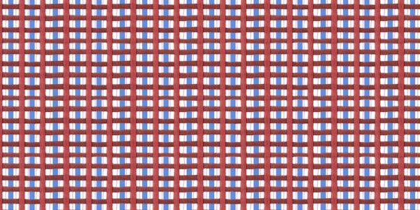
MASSAUA: The term Massaua refers to a very resistant cotton type fabric used for dishtowels and overalls. Felt-tip pens strokes of different colours and sizes were crossed and superimposed in the project for the Massaua laminate to obtain a new interpretation of the idea of fabric.
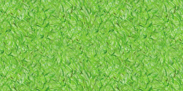
DERBY: Green pencil strokes (varying in intensity) simulate a luxuriant green lawn; the particularly interesting graphic result was a fillip to turn the drawing in different colours.
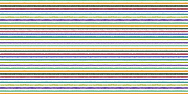
FURROWS: Horizontal lines reproducing the discontinuous signs of graphite, a series of parallel grooves, which can be coloured or black & white.
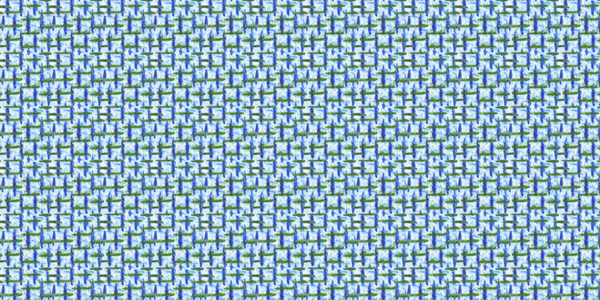
CANVAS: Coloured pencil strokes simulate a sort of “canvas” fabric, cross graphics scattered all over the background give life to a sort of three-dimensionality typical of embroidery.
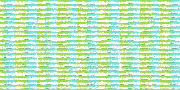
BETULLA: The starting point of this graphics is the technique of “frottage”, that is to say the rubbing of coloured pencils on a piece of paper placed over a textured surface; the result reminds the birch bark, hence its name.
